TOUCH WordPress Theme for Fast Mobile Websites

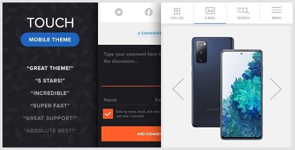
TOUCH is a premium mobile-focused WordPress theme developed by Bonfire Themes and designed specifically for smartphones and tablets. Unlike traditional responsive themes, TOUCH provides a dedicated mobile experience with touch-friendly navigation, gesture controls, and optimized layouts that deliver fast performance on mobile devices. It can be used as a standalone mobile website or alongside an existing desktop WordPress theme, displaying only for mobile visitors.

The theme combines a lightweight design with powerful functionality, making it suitable for blogs, portfolios, galleries, business websites, and content-driven mobile platforms. Its clean interface, swipe-enabled galleries, and extensive customization options help create an app-like browsing experience for mobile users

Key Features

Mobile-Optimized Design

  • Built specifically for smartphones and tablets.
  • Lightweight and fast-loading mobile interface.
  • Touch-friendly navigation and interactions.
  • Optimized user experience for smaller screens.
  • Can function as a dedicated mobile website or companion mobile theme.

Works Alongside Existing Themes

  • Compatible with existing desktop WordPress themes.
  • Can automatically display only to mobile visitors.
  • Allows separate desktop and mobile experiences.
  • Easy integration with current WordPress websites.

Advanced Mobile Navigation

  • Includes the popular Touchy mobile menu system.
  • Highly customizable header and navigation layouts.
  • Slide-out mobile menu functionality.
  • Optimized touch navigation for mobile devices.
  • Built using years of mobile usability improvements.

Gesture-Enabled Gallery

  • Integration with PhotoSwipe gallery system.
  • Swipe navigation between images.
  • Pinch-to-zoom functionality.
  • Touch-enabled image browsing.
  • Mobile-friendly gallery experience.

Retina Ready

  • Fully Retina-ready graphics and icons.
  • Sharp display on high-resolution screens.
  • Optimized visuals for modern smartphones and tablets.
  • Crisp typography and image rendering.

Blog & Content Features

  • Supports standard WordPress blogging functionality.
  • Optional static homepage support.
  • Multiple content presentation options.
  • Optimized reading experience on mobile devices.
  • Category and archive page compatibility.

Portfolio & Gallery Support

  • Portfolio presentation layouts.
  • Mobile-friendly image galleries.
  • Visual content showcase capabilities.
  • Suitable for photographers, designers, and creatives.
  • Touch-optimized portfolio browsing.

Built-In Shortcodes

  • Customizable buttons.
  • Alerts and notification boxes.
  • Content dividers.
  • Layout enhancement tools.
  • Easy content formatting options.

Custom Comment System

  • Unique animated comment form.
  • Mobile-friendly commenting experience.
  • Enhanced user interaction.
  • Smooth CSS3 and jQuery animations.

Loading Screen & Progress Bar

  • Integrated PageLoader plugin.
  • Customizable loading animations.
  • Progress indicators during page loads.
  • Improved mobile user experience.

Cross-Device Compatibility

  • Tested on iPhone and iPad devices.
  • Android device compatibility.
  • Windows mobile support.
  • Works in major browsers including Chrome, Firefox, Safari, Edge, and Opera.
  • Can even function as a desktop website if required.

Design & Animation

  • Elegant CSS3 animations.
  • Smooth jQuery effects.
  • Clean and minimal interface.
  • Modern mobile design principles.
  • Lightweight visual presentation.

Ideal Use Cases

TOUCH is ideal for:

  • Mobile blogs
  • Personal websites
  • News and magazine portals
  • Portfolio websites
  • Photography galleries
  • Creative agencies
  • Business mobile websites
  • Content publishers
  • Mobile-first WordPress projects
  • Dedicated smartphone and tablet websites

Summary

TOUCH – A Lighter-than-Air WordPress Mobile Theme is a specialized mobile WordPress theme designed to provide an exceptional browsing experience on smartphones and tablets. With touch-enabled galleries, swipe navigation, Retina-ready visuals, customizable mobile menus, loading animations, and support for blogs and portfolios, it offers a complete solution for creating fast and engaging mobile websites. Its ability to work alongside existing desktop themes makes it particularly valuable for website owners seeking a dedicated mobile experience without rebuilding their entire website

Post a Comment

TOUCH is a premium mobile-focused WordPress theme developed by Bonfire Themes and designed specifically for smartphones and tablets. Unlike traditional responsive themes, TOUCH provides a dedicated mobile experience with touch-friendly navigation, gesture controls, and optimized layouts that deliver fast performance on mobile devices. It can be used as a standalone mobile website or alongside an existing desktop WordPress theme, displaying only for mobile visitors.

The theme combines a lightweight design with powerful functionality, making it suitable for blogs, portfolios, galleries, business websites, and content-driven mobile platforms. Its clean interface, swipe-enabled galleries, and extensive customization options help create an app-like browsing experience for mobile users

Key Features

Mobile-Optimized Design

  • Built specifically for smartphones and tablets.
  • Lightweight and fast-loading mobile interface.
  • Touch-friendly navigation and interactions.
  • Optimized user experience for smaller screens.
  • Can function as a dedicated mobile website or companion mobile theme.

Works Alongside Existing Themes

  • Compatible with existing desktop WordPress themes.
  • Can automatically display only to mobile visitors.
  • Allows separate desktop and mobile experiences.
  • Easy integration with current WordPress websites.

Advanced Mobile Navigation

  • Includes the popular Touchy mobile menu system.
  • Highly customizable header and navigation layouts.
  • Slide-out mobile menu functionality.
  • Optimized touch navigation for mobile devices.
  • Built using years of mobile usability improvements.

Gesture-Enabled Gallery

  • Integration with PhotoSwipe gallery system.
  • Swipe navigation between images.
  • Pinch-to-zoom functionality.
  • Touch-enabled image browsing.
  • Mobile-friendly gallery experience.

Retina Ready

  • Fully Retina-ready graphics and icons.
  • Sharp display on high-resolution screens.
  • Optimized visuals for modern smartphones and tablets.
  • Crisp typography and image rendering.

Blog & Content Features

  • Supports standard WordPress blogging functionality.
  • Optional static homepage support.
  • Multiple content presentation options.
  • Optimized reading experience on mobile devices.
  • Category and archive page compatibility.

Portfolio & Gallery Support

  • Portfolio presentation layouts.
  • Mobile-friendly image galleries.
  • Visual content showcase capabilities.
  • Suitable for photographers, designers, and creatives.
  • Touch-optimized portfolio browsing.

Built-In Shortcodes

  • Customizable buttons.
  • Alerts and notification boxes.
  • Content dividers.
  • Layout enhancement tools.
  • Easy content formatting options.

Custom Comment System

  • Unique animated comment form.
  • Mobile-friendly commenting experience.
  • Enhanced user interaction.
  • Smooth CSS3 and jQuery animations.

Loading Screen & Progress Bar

  • Integrated PageLoader plugin.
  • Customizable loading animations.
  • Progress indicators during page loads.
  • Improved mobile user experience.

Cross-Device Compatibility

  • Tested on iPhone and iPad devices.
  • Android device compatibility.
  • Windows mobile support.
  • Works in major browsers including Chrome, Firefox, Safari, Edge, and Opera.
  • Can even function as a desktop website if required.

Design & Animation

  • Elegant CSS3 animations.
  • Smooth jQuery effects.
  • Clean and minimal interface.
  • Modern mobile design principles.
  • Lightweight visual presentation.

Ideal Use Cases

TOUCH is ideal for:

  • Mobile blogs
  • Personal websites
  • News and magazine portals
  • Portfolio websites
  • Photography galleries
  • Creative agencies
  • Business mobile websites
  • Content publishers
  • Mobile-first WordPress projects
  • Dedicated smartphone and tablet websites

Summary

TOUCH – A Lighter-than-Air WordPress Mobile Theme is a specialized mobile WordPress theme designed to provide an exceptional browsing experience on smartphones and tablets. With touch-enabled galleries, swipe navigation, Retina-ready visuals, customizable mobile menus, loading animations, and support for blogs and portfolios, it offers a complete solution for creating fast and engaging mobile websites. Its ability to work alongside existing desktop themes makes it particularly valuable for website owners seeking a dedicated mobile experience without rebuilding their entire website

$

  • Risk Free 15 Days Money Back Policy
  • Quality checked by Envato
  • 6 months support from CodeIdem
  • This is a secure SSL encrypted payment. Credit Card Certificate
info@website-theme.com Joined: January 2026
  • Tags

Get all products for only $59!

With our extensive collection of elements, creating and customizing layouts becomes
second nature. Forget about coding and enjoy our themes.